A Studio Rubín
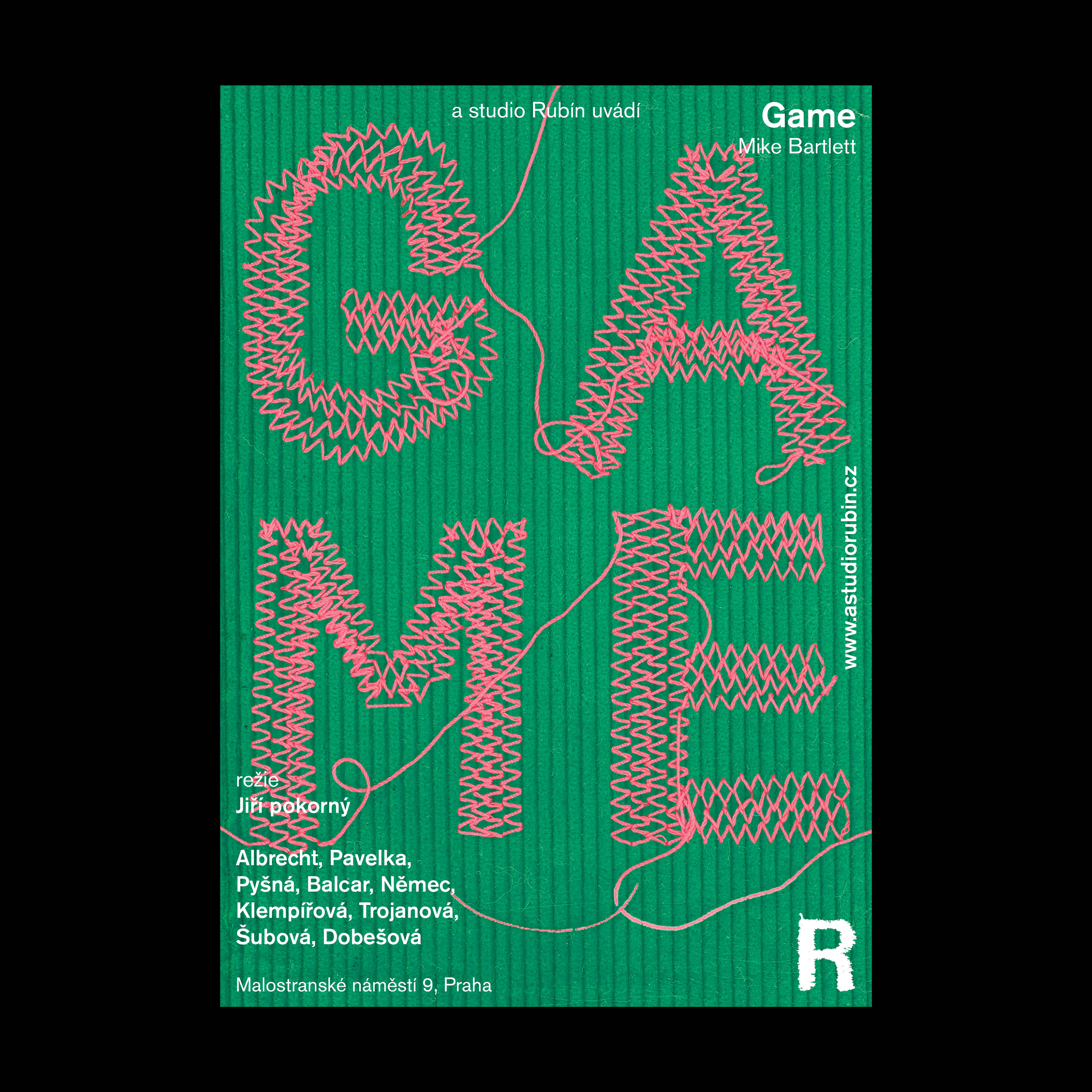
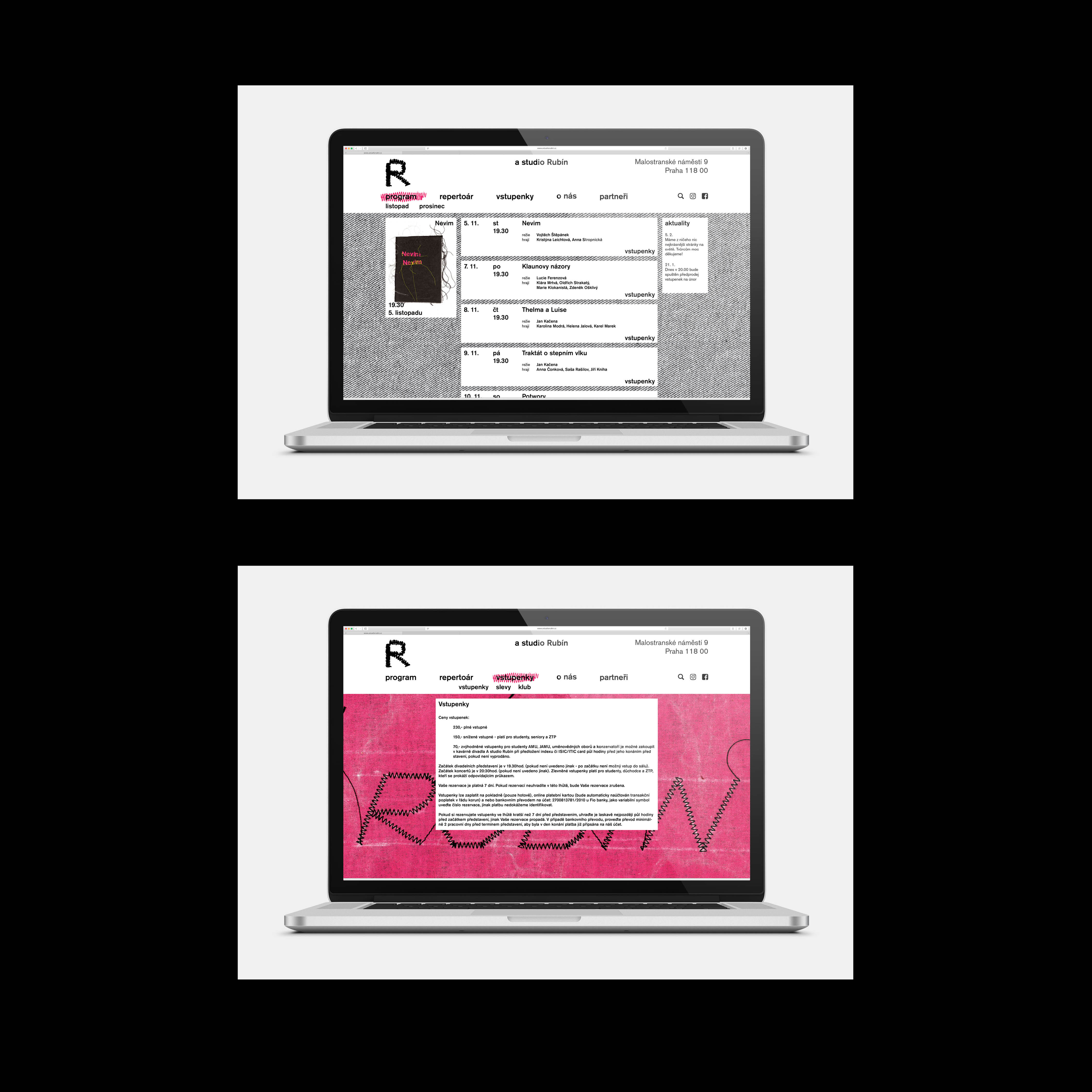
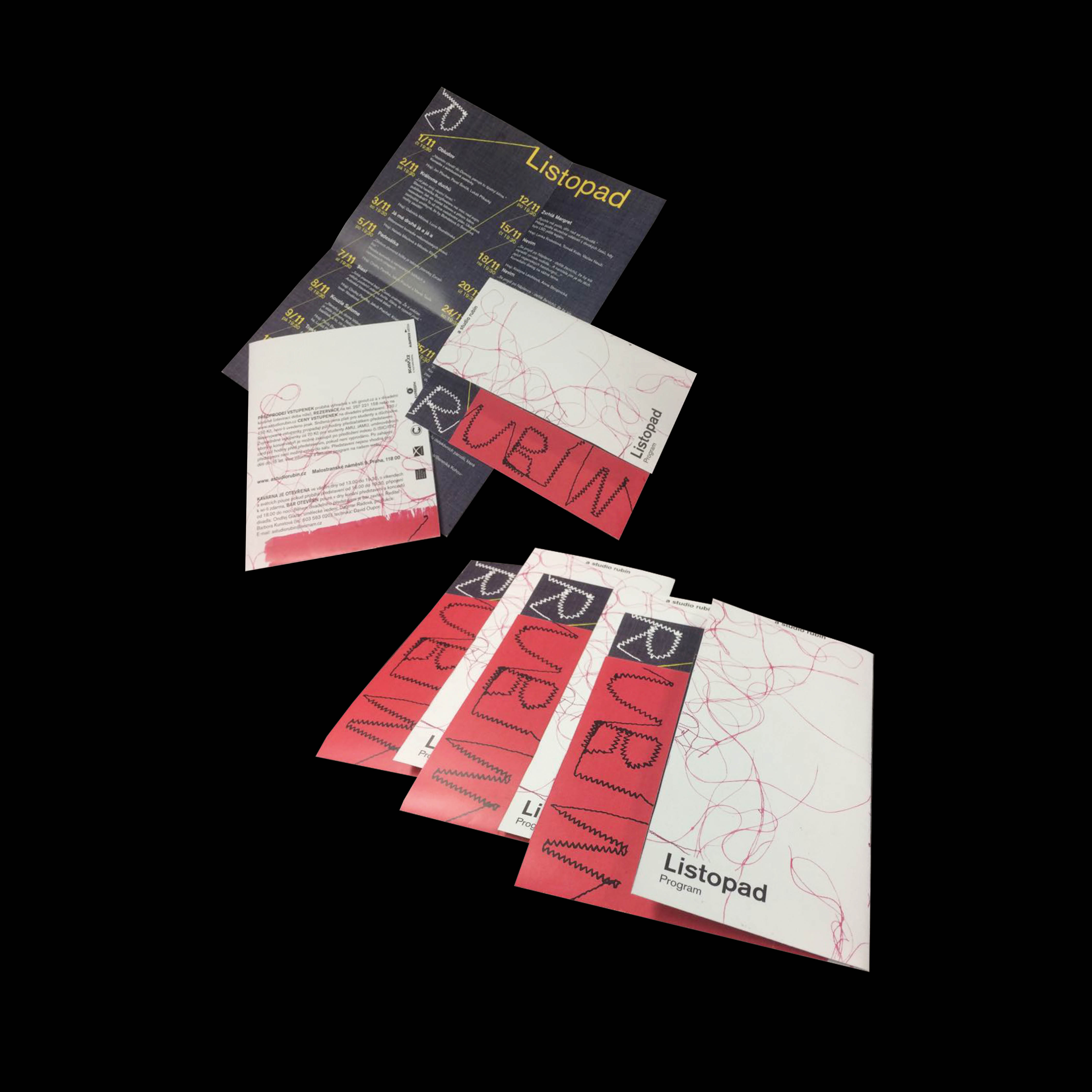
The concept of visual identity design A by the Rubín studio stands on a pun, it is changed from a stone designation to a derivative of the czech word rub (reverse). This fact reflects the new direction of the theater, which does not go with the flow of most Czech theaters, but turns the majority view upside down and shrugs in its own way. Just as none of the performance is the same, the basic brand of the theater alternates. The visual works mainly with the letter R, which changes its proportions and style. It thus responds to the change of atmosphere in space and the theme of each performance.
The concept of visual identity design A by the Rubín studio stands on a pun, it is changed from a stone designation to a derivative of the czech word rub (reverse). This fact reflects the new direction of the theater, which does not go with the flow of most Czech theaters, but turns the majority view upside down and shrugs in its own way. Just as none of the performance is the same, the basic brand of the theater alternates. The visual works mainly with the letter R, which changes its proportions and style. It thus responds to the change of atmosphere in space and the theme of each performance.
2018
Graphic design: Michal Max Mráz & Valerie Kamererová
Graphic design: Michal Max Mráz & Valerie Kamererová